
The two photos above are actually one and the same. I left them on the dining room table today and even with diffused light coming in through the sheers, it's amazing what can happen! A scene can become even more real like without doing anything to it.
The neat thing is.... you can't screw up with your colours. If you stamp a beautiful scene and then painstakingly colour it with dye based inks and find that the colours are too vivid, too dark or what have you when you're finished.... let them sit out to fade a bit and then ink over top of what you've already done! Simple!
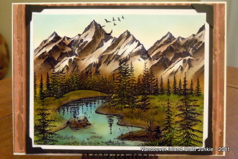
In my last post I coloured three scenes, each a bit differently. Everyone has their own favourite with the originals, but, now that the colours are toned down... will they have a new favourite from the bunch? From what I see... I like the toned down grasses but, the water has lightened up too much and reminds me of the ocean in the Carribean. The only time you get streams that even closely resembles that colour you need to go high up in the Rocky Mountains where the water is sooooo cold you wouldn't dare dip a toe! Even then they would be more of an ice green tint. In a valley, such as this scene portrays, the water would seem just as clear but would definitely be darker. If I were to add more colour, I'd add Distress Weathered Wood to the areas the sun doesn't bounce off of. (Tip of the day!)
I'll now post the before and after photos of the other two and we'll see what comments I get! This should be interesting!!
 Before
 After
AfterScene #3
 Before
 After
After
I'm going to be working on new scenes and a Tips and Tricks posting shortly. Hopefully I'll be able to pass on some tips that I've had to stumble onto while trying different things on my own. That posting will be one that I'll continue to add to for as long as I do Stampscapes!
Have a wonderful evening and I'll talk to you all again soon!
Hugs,
Sheree


