Showing posts with label Masculine Birthday. Show all posts

Tuesday, 5 March 2013

All Geared Up!

Good Evening Girlz!

I have been having so much fun playing around with the different Inka Gold colours lately.  I now have red, gold and silver and hope to add more to my stash soon! (Hurry up and order more colours Victoria!..my enabler!)


I used the Gears die by Ranger.  First off I used the Distress Silver Paint and instead of rubbing the paint on I squeeze the bottle and dab it on so it creates a textured surface.


Once the paint dried..only takes a couple of minutes... I used my VersaMark pad and rubbed it on here and there and then dumped on a rough embossing powder put out by Stampendous and then sprinkled on Zing embossing powder in glitter black.
 
 
Here is a close up of the embossing...
 
 
And a photo from the side..


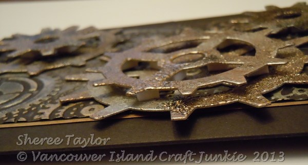
For the background I used the Gears embossing folder by Sizzix for Tim Holtz.  After embossing the black cardstock I started adding the Inka Gold colours in Silver and Gold.  It dries very quickly and then use a paper towel to buff it up so its shiney.


To finish it off I popped some of the gears up and it was done!
 
Thanks for looking!
 
Hugz,
Sheree


Thursday, 20 December 2012

Distressed Masculine Birthday Card


I did this quickly for my sons birthday last weekend.  I was so engrossed with getting everything ready for he dinner that I forgot the card..oops!  So, I pulled out the Tim Holtz Gears die and cut them out on grey Stampin Up! cardstock.  The gears were distressed with Walnut, Gathered Twigs and Black Soot.  I swiped my VersaMark pad over the gears and piled on the clear embossing powder.  The last thing was to sprinkle some Zing black embossing powder heavy in some spots and then heavy in others.  Here are a couple of close ups so you can see what I have done...


I think the gears turned out pretty neat!
You can see how I popped the smaller one up along with the one below.

The background is a Cuttle Bug folder and a dull silver paper.  After I embossed it I dabbed a bit of black VersaFine ink onto a paper towel and lightly went over th embossing to make it look  bit aged...like a worn toolbox!  I find that this ink dries a bit quicker if you want to do something else with the paper.

There you go!

Thanks for looking!  I hope you have a wonderful Christmas Holiday!

Hugz,
Sheree

Sunday, 4 March 2012

Stampscapes - Moonlight Tutorial

Good Morning Chicks!

I'm going to walk you through my moonlight scene for the March challenge over at Craft A Scene  I hope you'll be able to follow what I've done in the photos because the lighting isn't the best at home.


Step 1  -  Build the scene

I started by using the Country Stream stamp with Archival Black ink and Hero Arts clear embossing powder.  I find that Hero Arts is nice and fine so works well on detailed images.

Using tacky paper that I bought on a roll from Crafty Capers in Nanaimo I punched out a small 1" circle and stuck it down for the moon.  You will notice that I only did that on one card.

Let the image cool after embossing and then tap in some Lemonade with a ColorBox stylus or sponge tool of your choice.  I have also found that embossing the stamped images can create a kind of frosty effect which you will see in some of final photos.
 

Step 2 - Second Layer of Colour

Sometimes the moon will look white and sometimes it will have a yellow tone.  On this scene it will be yellow.  Due to dye inks fading out I used cantalope on the outer edges to intensify the colour.  I know.. you're thinking that I've got a loose brick upstairs and it's waaay too bright!  Dye inks fade over night so don't worry about it being darker.


Step 3 - Third Layer of Colour

Now we'll add the lightest blue called Aqua around the areas in yellow.  Why?  Well, when I look at the sky, the yellow fades to blue/black.  We'll be colouring over most of it anyway.  I like to add it now because there's no turning back once the darker shades are blended in.


Step 4 - Fourth Layer of Colour

Now doesn't this look horrendous???!!  After I added Stonewashed to the scene I realized that it's time to change now or forever hold my peace!  Never worry that you've ruined it!  Most can be saved by either leaving it in bright sunlight to fade the colour or, add something darker to cover it up!  One nice thing is that we will be going darker and darker so it will be hidden anyway.


Step 5 - Fifth Layer of Colour

This is actually a step for two colours!!  I just noticed that I didn't take a photo prior to adding Pitch Black!!
  
Before adding the black, use Adirondack Stream with the stylus and tap it from the outer edges in.  Don't worry about it looking so dark because it will lighten up beautifully!

Now you can start adding the black!  Oooops!

Are you still with me on this long process??  Now the fun begins!  This time I'm adding Pitch Black which is going to tone down the brights and make it more rich looking...to me anyways!  Tap it on from the outside in.  Be patient and things will come together!


Here is a closer view.  Still kind of looks like @%*# but you never judge a painting before it's done.

Step 6 - Add tree limbs to disguise any boo boo's or as a fill in

When you're finished the colouring, peel the tape off of the moon.  It will look stark white and unrealistic so... grab Lemonade (from the first photo) and tap a bit in around all of the edges.  Next, tap in some Cantaloupe on the left half.  This will give it more dimension!

Next I stamped the oak limb stamp and embossed with clear embossing powder.  I will emboss the stamped images at times to give it a bit more dimension and texture.  You can kind of see that in these photos for once!


Step 7 - Add Highlights

I added highlights with my white paint pen.  Love that thing!  Take care not to overdo it.  Then again, as the dye inks fade a bit, the white highlights blend in a lot more.


And now, here are the scenes mounted.  They look fabulous IRL.  I used Bo Bunny paper which looks stunning and rich.  Prior to mounting I did a wee bit of distressing with Black Soot along the edges.  My camera was not kind once again....  The second photo is actually darker than it shows.


The recipe is....

Stamps:  

Stampscapes - Nature Sheet 1 - Country Stream
Stampscapes - 203G - Oak Branch
Stampin' Up! - Sentiment
Inks..
Adirondack - Lemonade, Aqua, Stonewashed, Stream, Pitch Black
Memento - Cantaloupe
Archival Black
Distress Black Soot
Clear Embossing Powder
Hero Arts White Embossing Powder (Sentiment)
White paint pen
Paper:  BoBunny, Recollections, Staples White

 There you have it!  Have fun creating your own moonlight scene!

Hugs,
Sheree

Challenge Entries For...

Birthday Sundaes - Must have birthday sentiment


Monday, 13 February 2012

Stampscapes - Spring Meadow


Evening Chicks!
Here's a quick post for tonight!   I actually started this Stampscape  couple of days ago.  I've been doing quite a few snow scenes of late and, that's the theme for us over at Craft A Scene for the month of February!  It was pouring rain with wind a few days ago and all I could think about was Spring getting here as fast as possible.  The heavens listened and for three days, including today, we are having sunshine here on the west coast!
I wasn't prepared to give my 'Stamp Eater' a bath today but had to do one with the hose outside.  Poor thing was shaking and cold but, she had found two deep mud holes filled with water and decided that today was the day she'd try and dig to China!  There was water and mud flying all over the place and I'm really not sure how she could put her whole head down in there.. eww!  I'm sure you all know what swampy soil smells like which is why the big goof had to be done with the hose outside.  All is well now.  She started liking me again an hour ago!
Back to the scene!  I stamped this one twice and ended up with one good one.  I'm wishing I would have extended the tree line on the horizon but, it's done and I'm going to put effort into thinking up a new one instead.  I kept the colours (Canadian spelling!)  fairly light, as light as possible.  The initial colouring looked quite dark but, dye inks fade so I left it out on the table and added more colour the following day.  
Once that phase was done I brought out my JellyRoll Star pens and dotted in wild flowers and also added highlights on everything with my white paint pen.
I left the scene on my craft table (should call it a mountain instead) and it lightened up again perfectly!  The lighter colours were quite dull though so I took my stylus loaded with Memento Cantalope and went over everything with it.  What a difference!  The trees popped, the dull rocks looked more rocky and the spring grass looked new, as it should!
Next was mounting, cut an insert to stamp the sentiment on and voila!

The recipe is...
Stamps - Stampscapes!
057G - Meadow Large
196F - Pine Tree (My favourite!)
299B - 3 Rocks And Grass
301A - Rocks And Grass
302A - Gulls

Inks...
Adirondack - Aqua, Mushroom, Meadow, Lemonade, Black, Citrus
Memento - Cantaloupe, Morning Sky, London Fog, Bamboo,
Distress - Frayed Burlap, Crushed Olive

Ribbon - Michaels
Paper - Glossy, Recollections, Costco Jumbo Pack
Crimper

Hope you all have a wonderful work week and I'll post again soon!

Hugs, Sheree

Wednesday, 4 January 2012

Stampscapes - It's The Little Things

Good Morning Chicks!

Well it's another day of wind and rain here on the island.  Spring just can't get here quick enough now.  I'm getting antsy about working in the mud!

This is a very easy scene I came up with last night.  I actually had six of them done in just over one hour!

First off, I love my little sentiment that says.. it's the simple things, that I purchased from Michelle's Scrapbooking and More web store.  I took the word simple and ran with it!

Everything on this scene was inked with one colour... Distress Walnut (key word - simple).  The distressing was done with the same and then using my nail I roughed up the edges and mounted on dark brown cardstock.  The rest is self explanitory I'd say!  Here's a closeup of the scene itself!


The recipe is:
Stamps - Stampscapes
048E  Lakeside Cove
018E  Columbus Cloud
166A  Row Boat
196F  Pine Tree

Ink - Distress Walnut
Papers - Recollections & Staples
Dots - Dollarama

Thanks for looking and have a wonderful week!

Hugs,
Sheree

Friday, 18 November 2011

Stampscapes - Last Catch Of The Day


Good Evening Chickees!

This Stampscapes card started out as a tutorial.  I took pictures every step of the way.  When I went to post everything... the photos only showed up in the download as an icon!  So.. I'll be trying another one and hopefully it won't screw up as well haha!
This birthday card is for my hubby's ex-wife's father who is the funniest person on the planet!  Also, I will be entering it in The Outlawz Monday Greeting Card Challenge and the theme is for men/boys.
I sized this card to fit in a standard envelope that I use in the office.  Thought I'd do something different that the standard 5X7 or 4X5.  Turned out pretty kewl!

The recipe is as follows:

Stamps:
Stampscapes
050E  Lakeside Reflections
048E  Lakeside Cove
267E  Pines and Rocks
040B  Geese in Flight
166A  Row Boat
Sentiment
Stampin' Up!
Paper:  Recollections, BoBunny Forever Fall Foliage
Inks: 
Archival Black
Distress:  Frayed Burlap, Gathered Twigs, Persimmons
Big n Juicy Foliage
Versa Mark

Clear Embossing Powder
Gold Embossing Powder
White Paint Pen

Thanks for looking and have a wonderful weekend!

Hugs,
Sheree

Tuesday, 20 September 2011

Stampscapes - Autumn Sunset

Good Afternoon!
What a fun day today.  I skipped from work (I'm the boss) and stayed home to do more painting on the house before the rain and wind sets in tonight.  So... while I cook dinner I thought I'd post this card that I made two days ago for one of my clients.
Jerry came up to Campbell River last Friday to attend a funeral and near the end of the funeral his sister had to rush him to the hospital because he couldn't move his left arm.  Turns out he had a stroke due to bleeding on the brain.  To make a long story short, I thought we were going to lose him but... my Korean Veteran started coming around!  He is still paralized on his left side but we are hoping that when the pressure on the brain slowly goes away he will regain use of his left appendages.  I'm thinking positive!
I put this card together because Jerry was a commercial fisherman after the war and he would go fishing today but his body is slowing down which makes it hard to launch a boat.  He just LOVES fishing!
There are two sentiments on the inside of the card.  One is 'Get Well Soon' from Stampin' Up! and the other is one from Stampscapes.  I embossed all images with clear embossing powder, doing each one as it was stamped.  The background was brayered with a 'Big and Juicy' pad and then Raspberry at the top to intensify the colour a wee bit more.  Only one print was used for background paper.  I was inspired by the colours in the maple leaves which  don't really show well.
Here is the recipe!
Stamps - Stampscapes & Stampin' Up!
302A - Gulls
266D - Tree cluster
195G - Pines and Rocks
048E - Lakeside Cove
166A - Rowboat

Archival black ink, Big and Juicy, Adirondack Raspberry Dye Ink

Paper - Glossy, Bazzil, Staples 110 lb. white, Indian Summer - Aspen - Basic Grey

Rubber brayer
White pen for highlights
Marth Stewart photo corner punch

Thanks for looking and may you have the most wonderful week!

Hugs,
Sheree

Challenges:
Cards for Men - Anything but square
Oldie But A Goodie - One For The Boys

Wednesday, 14 September 2011

Fall Is On It's Way!

Morning Everyone!
Another idea popped into my head last night so quickly put this together and I like how it turned out!
First I stamped  the leaves with VersaMark and embossed with Crafty Capers Copper Tinsel.  Veins were coloured lightly with Copics. 
Now I'm off to The Outlawz to enter my card in the Saturday challenge!
Hope you're having a wonderful day!
Hugs,
Sheree

Friday, 9 September 2011

Flourishes - Masculine Card


Hey there Chickees!
Yep... I'm back for a wee bit.  It's been a crazy couple of weeks at work and at home.  Painting the exterior of the house is taking a little longer than usual.

I'll post more later... had a 6.8 earthquake north of us and aftershocks are supposed to happen.  We only felt a little bit here but must head home to check my puppies cuz they are probably scared..

Talk to you soon!!

Hugs,
Sheree

Back in business.  The earthquake wasn't that bad but I have a dog that sees ghosts and flies freak him out.  Max needed a big hug when I got home haha!

Back to the card I posted!  The image is from Flourishes - What a Catch! set.  I found this set two weeks ago and have been playing around with different colour combinations.  This one ... I like!

There's a fish hook tied to the sisal twine but it moved while I took the picture so the hook end is hard to see.  It's there though!!

The recipe is as follows:
Stamps - Flourishes, Studio G
Ink - Memento Black, Distress - Burlap
Paper - Staples, Recollections, Stampin' Up!
Ribbon - Looks like fishnet but is actually 2 1/2 inch woven that I stretched out of shape.  This one is dark green and gold woven in
Colouring - Copics
CuttleBug - Woodgrain folder
Embossing powder - Crafty Capers glittery copper
Spellbinders Diamond Dies
Pop dots

There you have it!  Hope everyone is having a wonderful weekend!

Hugs,
Sheree

Wednesday, 13 July 2011

Stampscapes - Masculine Generic

Good Evening and Happy Hump Day!
It's finally Wednesday and we're on the downhill slide to the weekend!  WooHoo!
I started this scene the other day.  After a few botched tries I finally have a scene I like.  I started inking it right afterwards and things were looking kind of dark (along with the circles under my eyes) so I set it aside until this evening.  The dye inks had faded to something I could work with so started applying colour where needed and this is what I ended up with!  Once the scene was finished I was going to put a bear or stag in the meadow but they would have looked too large and as far as I know there aren't any Kong Deer here in Canada haha!
This is a close up of the bottom left corner so you can see where I put the colour.  After spraying the image with a glossy varnish I got out my JellyRoll pens and added some red flowers and faint bits of glitter on the tree tips.
Here is the recipe for this:
Stamps:
Sentiment - Little Paper Shop (Moments)
Scene Stamps - Stampscape
057G - Meadow Large
196F - Pine Tree
251C - Sedge Filler
211C - Rocky Peaks
Paper:  Recollections, Glossy White & Stampin' Up! Kiwi
Embossing Folder:  Couture Creations - Entangle
Inks:
Adirondack Dye Ink Pads - Lemonade, Willow, Citrus, Meadow, Stonewashed, Butterscotch, Mocha, Pesto
Memento Dye Ink Pads - Summer Sky, Cantalope, Cottage Ivy, London Fog, Black
Distress Inks - Frayed Burlap
JellyRoll Star Pens - Red & Clear Star
Clear Embossing Powder
Dried Spanish Moss - Dollarama
Pop Dots
Colorbox Stylus
Thanks for looking!
Hugs,
Sheree

Wednesday, 15 June 2011

Stampscapes - Father's Day / Birthday

Hi Everyone!
My DH? is upstairs watching the Stanley Cup so I'm downstairs posting a card I put together last night.  I think this one turned out pretty neat even if it's rather mundane in that I am once again using my three favourite stamps (this month)!
I started off with white glossy cardstock and used the brayer with my Antique Linen Distress Ink pad.  Because some inks fade quickly I brayered over the paper many times with a vast amount of ink just to see what happens.  I was pleased to see that because I brayered so many layers.. the colour didn't fade much at all.  My expert photography skills don't show the colour off well but it looks good!
The next step was to place the stamps one by one.  Each one was stamped in Archival Jet Black and immediately embossed with ultra fine clear embossing powder.  Here is an angled view that shows off the embossing along with the Diamond Stickles I added for highlight!
Now that the photo is uploaded I see that the Stickles aren't showing up well at all!  I added it along the waterline of the rocks and into some of the reflections.
The next step was to chop everything up and glue it onto the black paper.  That was in turn mounted onto the kraft cardstock.  Now here's a wee, little secret!  The kraft cardstock was actually purchased at WalMart and I found it by accident while looking for office supplies.  The package contains 50 cards and 50 envelopes for just over $7.00!  Normally the ready made cards they carry are of a very lightweight cardstock... quite flimsy actually.  The kraft ones work great!
Here's the recipe!
Stamps:
Stampscapes -
023A    Duck Trio
267E     Pines and Rocks
046E     Lakeside Cove
Sentiment -
Innie & Outie by My Sentiments Exactly!
Paper -   WalMart, Recollections
Ink -  Archival Jet Black
Diamond Stickles
Ultra fine embossing powder
Brads
There you have it in a nutshell... Thanks for looking!
Hugs,
Sheree

Monday, 21 February 2011

Masculine Generic

Hello again!

I had an idea pop into my little brain on the way home tonight so I threw dinner in the oven and went to work on bringing my idea to life.
I started with the Stampscape images, slowly building until I was happy with it. Some stamps you may not recognize as I stamped them half off the page, like the small lakeside cove.
The inks used were: From Adirondack - Aqua, Stonewashed, Willow, black; From Memento - Potters Clay, Cottage Ivy; From Distress Pads - Frayed Burlap, Crushed Olive and Weathered Wood.
Once I was finished I sprayed the image with glossy laquer and highlighted a few tiny spots with a glitter gel pen in platinum. I looked at the photo I took and those highlights don't show but they do look great when the card is tilted. As I always do of late, used the Martha Stewart photo corner punch to make it look like it could have been a photograph.
The sentiment is from Thomas Kinkade and states: 'If people concentrated on the really important things in life, there'd be a shortage of fishing poles.'
The papers were random ones I had from a huge package from Costco. (I'm finally using them!) I stitched them together and then popped the image up on top. The sentiment was stamped onto cream cardstock, stitched and then the edges ripped and distressed.
One thing I should have done was to find some of my old fishing gear to stick on there. Hmmm.. I think I know where it may be so if I do remember to add some I'll post an updated photo!
Thanks for looking!
Posted by Picasa

Monday, 24 January 2011

Masculine Birthday

You'll notice, over time, that I make more masculine cards than pretty, fancy ones. We have four boys and I do homecare for War Veterans so... there you have it in a nutshell!
I LOVE my new Stampscapes stamps!! The main image was sponged on glossy photo paper using Adirondak Dye Pad Inks. I started with Aqua all over and then started blending in Pool and Stream, adding layers of each until I acheived the depth and look I wanted! The main stamp is Prickly Branch from Stampscapes and the sentiment is from Stampin' Up!, both stamped with Archival Black.
The card stock itself is Kraft and the mottled cardstock background is unknown but from a large pack I purchased at Costco a few years ago. I finished it off with just a couple of brads from Michael's.
I'm sorry now that I didn't take a picture of the other card which is a mate to this one except for the sentiment was Get Well Soom. After many botched attempts at finding the right opaque white accent pen (Uniball Craft Pen - White) I added snow to many of the branches and random sized snowflakes falling from the sky... It turned out awesome!
Hope you like it and thanks for looking!
Posted by Picasa