Showing posts with label Stampscapes Tutorials. Show all posts

Sunday, 4 March 2012

Stampscapes - Moonlight Tutorial

Good Morning Chicks!

I'm going to walk you through my moonlight scene for the March challenge over at Craft A Scene  I hope you'll be able to follow what I've done in the photos because the lighting isn't the best at home.


Step 1  -  Build the scene

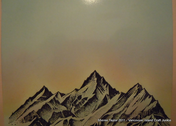
I started by using the Country Stream stamp with Archival Black ink and Hero Arts clear embossing powder.  I find that Hero Arts is nice and fine so works well on detailed images.

Using tacky paper that I bought on a roll from Crafty Capers in Nanaimo I punched out a small 1" circle and stuck it down for the moon.  You will notice that I only did that on one card.

Let the image cool after embossing and then tap in some Lemonade with a ColorBox stylus or sponge tool of your choice.  I have also found that embossing the stamped images can create a kind of frosty effect which you will see in some of final photos.
 

Step 2 - Second Layer of Colour

Sometimes the moon will look white and sometimes it will have a yellow tone.  On this scene it will be yellow.  Due to dye inks fading out I used cantalope on the outer edges to intensify the colour.  I know.. you're thinking that I've got a loose brick upstairs and it's waaay too bright!  Dye inks fade over night so don't worry about it being darker.


Step 3 - Third Layer of Colour

Now we'll add the lightest blue called Aqua around the areas in yellow.  Why?  Well, when I look at the sky, the yellow fades to blue/black.  We'll be colouring over most of it anyway.  I like to add it now because there's no turning back once the darker shades are blended in.


Step 4 - Fourth Layer of Colour

Now doesn't this look horrendous???!!  After I added Stonewashed to the scene I realized that it's time to change now or forever hold my peace!  Never worry that you've ruined it!  Most can be saved by either leaving it in bright sunlight to fade the colour or, add something darker to cover it up!  One nice thing is that we will be going darker and darker so it will be hidden anyway.


Step 5 - Fifth Layer of Colour

This is actually a step for two colours!!  I just noticed that I didn't take a photo prior to adding Pitch Black!!
  
Before adding the black, use Adirondack Stream with the stylus and tap it from the outer edges in.  Don't worry about it looking so dark because it will lighten up beautifully!

Now you can start adding the black!  Oooops!

Are you still with me on this long process??  Now the fun begins!  This time I'm adding Pitch Black which is going to tone down the brights and make it more rich looking...to me anyways!  Tap it on from the outside in.  Be patient and things will come together!


Here is a closer view.  Still kind of looks like @%*# but you never judge a painting before it's done.

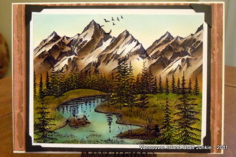
Step 6 - Add tree limbs to disguise any boo boo's or as a fill in

When you're finished the colouring, peel the tape off of the moon.  It will look stark white and unrealistic so... grab Lemonade (from the first photo) and tap a bit in around all of the edges.  Next, tap in some Cantaloupe on the left half.  This will give it more dimension!

Next I stamped the oak limb stamp and embossed with clear embossing powder.  I will emboss the stamped images at times to give it a bit more dimension and texture.  You can kind of see that in these photos for once!


Step 7 - Add Highlights

I added highlights with my white paint pen.  Love that thing!  Take care not to overdo it.  Then again, as the dye inks fade a bit, the white highlights blend in a lot more.


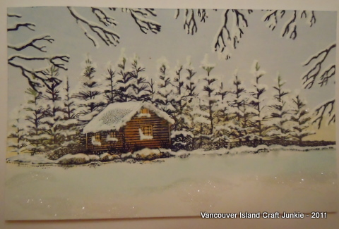
And now, here are the scenes mounted.  They look fabulous IRL.  I used Bo Bunny paper which looks stunning and rich.  Prior to mounting I did a wee bit of distressing with Black Soot along the edges.  My camera was not kind once again....  The second photo is actually darker than it shows.


The recipe is....

Stamps:  

Stampscapes - Nature Sheet 1 - Country Stream
Stampscapes - 203G - Oak Branch
Stampin' Up! - Sentiment
Inks..
Adirondack - Lemonade, Aqua, Stonewashed, Stream, Pitch Black
Memento - Cantaloupe
Archival Black
Distress Black Soot
Clear Embossing Powder
Hero Arts White Embossing Powder (Sentiment)
White paint pen
Paper:  BoBunny, Recollections, Staples White

 There you have it!  Have fun creating your own moonlight scene!

Hugs,
Sheree

Challenge Entries For...

Birthday Sundaes - Must have birthday sentiment


Saturday, 14 January 2012

Stampscapes Tutorial - Morning/Evening Skies

This tutorial is posted on my blog and will be posted on the Create A Scene blog commencing Sunday, January 15th!


Here is a quick tutorial on how I achieve skies in my Stampscapes scenes.  I have had many requests by my blogging friends to do a tutorial for them to learn from.

For these I work on glossy cardstock.  I have found that blending is easier on glossy rather than regular cardstock unless you are using Distress Inks.  The stamp pads used are shown in each photo and at the end of this post I will list the recipe!  When working on glossy card stock I find that Ranger Adirondack dye inks along with Memento dye inks work the best for blending. 

Everyone sees their surroundings in a different light.  This is how I see my skies where I live, (When it's not raining!).  This is one way of colouring the sky.   Just as there are thousands of different scenes shown on the internet, there are thousands of ways to colour your sky.  Always remember that there really is no wrong way of doing things.  We are all artists at heart! 

Step 1:  I lightly tap in yellow along the mountain tops, or along the horizon of the scene.  Don't worry about getting too much yellow in there.  At first it may seem too bright but these dye inks will fade!  When using your stylus, make sure you aren't heavy handed.  Instead of blended colours it will look like coloured footballs all over your scene.

 Step 2:  We are going to tap in the blue for the sky this time.  For this I always start out using Adirondack Aqua or Memento Summer Sky.  Load your stylus with ink and tap in colour starting at the upper edge of the sky and work towards the yellow.  This step will take a few minutes.  These colours are light but appear darker with every layer to add.  For me, this is the boring part!!  It's worth taking your time though.


Step 3:  Now is when we start adding the colour!  I tend to use pink and very lightly tap in colour.  Once again, dye inks will fade so don't despair if you feel you've overdone it!  This is also the point where I will add more colour to show sunsets or a sunrise.  As you add darker colours like a fiery fushia or orange, keep in mind that these colours are darker so you'll have to watch how much you add.  Load your stylus and tap on dry, scrap paper to remove most of the ink.  Layers of colour will intensify your sky but too much in a darker hue, too soon, can ruin your beautifully stamped scene!   I am still playing around with incredibly colourful sunrises.  Whenever there's a clear morning I look to the horizon when out with the dogs.  Yes, when there's a beautiful sky to take in... I put everything else on ignore!  haha!


The photo above shows how dark the colours are when I've finished my sky.


This next photo shows just how much the sky lightens when sitting overnight!  If you find it's too light, now is the time to add more colour.  Also, I always put a touch of colour from the sky onto the face of the mountain.  I added a bit more in this shot so you would be able to see it but normally add just a touch.

I also put my Stampscape scenes together by building them around a sentiment I want to use. Sometimes just one or two stamps will do the trick so don't ever feel pressured to create a scene that always has one of everything in it!


Sky Number Two!

Okay.. this doesn't look like much but I wanted to show you how to stamp the clouds as it took me a while to figure this tip out.


The sky above looks like it would be hard to do but in reality... it's easy peasy!! 

Here's what the rubber Stampscapes stamp looks like.

This is what the image of 018E Cloud Cumulus looks like in black and white.  I imported this image from the Stampscapes web-site.

To achieve the sky that I stamped in the photo, load the stamp with Distress Ink Walnut.  Now don't stamp right away!  Use a dry paper towel and gently dab along the edges of the stamp so the image will feather out.  I also lightly dab the dark area in the middle of the stamp because I wanted this piece to look like an aged photo.  Also, if you don't dab the edges of the stamp you will get a rectangle of clouds that will be hard to match up. 

If you are creating a sky on a larger piece all you have to do is keep stamping, but change up the stamp by turning it upside down here and there as well.  Always remember to feather the inked edges with a dry paper towel so everything will blend together nicely.

There you have it!  Simple skies the way I do them!  I'm hoping to find out how to colour the Northern Lights one of these days.  They are gorgeous!

Have a wonderful weekend and Happy Stamping!

Hugs,
Sheree

Inks used in this tutorial for the sky...
Ranger, Adirondack Dye Inks:  Aqua, Lemonade, Pink Sherbet
Memento Dye Inks:  Summer Sky
Distress Ink Pad:  Walnut

Inks used to finish colouring the mountains on the finished piece for the tutorial:
Distress Inks:  Frayed Burlap, Gathered Twigs, Iced Spruce
Memento Dye Inks:  London Fog

Stamps used on finished piece used for the tutorial:
Stampscapes 188F - Rocky Peaks
Stampscapes 302A - Gulls

ColourBox Stylus
Ranger Distress Applicator

PS ...  Don't forget to keep checking our challenge blog Create A Scene for more tutorials done by incredible artists from our design team.  Become a follower and enter the challenges while you're at it!
PPS ... I just noticed that I forgot to trim off the bottom of the scene because I wasn't going to stamp tree tops in front of the mountains... OoooopS!!

Saturday, 3 December 2011

Stampscapes - Lakeside Christmas

Good Evening Chicks!

I've been playing with winter scenes again tonight and this is what I ended up with.  I decided to use the Lakeside Cabin stamp because I know so many that have it.  This isn't as nice as the random scenes but turned out not too shabby.  The scotch pines on this stamp are a little trickier to add snow to than the fir trees on stamps that go with Lakeside Cove.

Now I'm going to try and show you how I ended up with this scene using only two stamps!
This first photo shows you the stamps as you will recognize them...
Before I stamped the Lakeside cabin I taped off the water reflections but left the rocks showing on the shore.  Even in the high country of the rockies you'll see less snow along the waters edge...depending where you are.  On the ocean.. you'll really see the rocks and there's more snow coverage as you move away.  The tree branches framing the scene are done with Spooky Branch.  I like the Bare Branch stamp better but don't have that one yet!
The cabin was coloured using Distress Gathered Twigs and Cantalope.  The sky was acheived using Memento Summer Sky and Adirondack Lemonade tapped along the horizon.  The look of cold snow and drifts pop with Adirondack Aqua and Memento London Fog.

Now, here's the snow!!

To put snow on the trees, roof, and rocks I used a Uniball White Paint Pen.  Nothing else works like them.  There's no blobs or thick lines.  With this pen you actually have to keep colouring with it but, if you want fine lines or dots.. there's nothing like it!
Once the snow was added I used MS clear fine glitter to accent the snow on the lake, the cabin roof and on some tree limbs.
Once you mount it... it looks much better!  Here is a closer look at where the glitter was added.  One more tip... I used my glue pen for snow.  It dries clear but goes on light blue.  All of the craft stores have them and with the ball point tip you can add as little or as much as you like!
Now... here's the card mounted.  I was going to add snowflake embellishments arount the edge but that took away from the scene.


Thanks for looking and I hope you all have a wonderful weekend!

Hugs,
Sheree

Challenge entry for
Gingerloft - Winter or Christmas

Saturday, 18 June 2011

Stampscapes Tutorial - Brayered Scene

Hi Everyone!
Just thought I'd post this as I finally have a few free minutes at the shop!  I was playing around with the brayer last week and actually remembered to take a few photos along the way.  Hope this gives you some insight to what I'm doing on this end.... it's easy peasy!


First off I used Memento Summer Sky as my base layer.  I didn't want it to fade so brayered many layers of this one colour.  Also... for my scenes I don't brayer like everyone else.  Whenever you take a class or watch a video the instructor says to go lightly in one direction so you don't get lines.  This is true for the most part and I do this for some cards with lighter coloured inks!   For me it's... au contraire grasshopper!  I've found that loading my Speedball brayer with lots of ink works great... start brayering at the top or side to start and move the brayer down as you go.  I use quite a bit of pressure and the ink goes down the paper with it.  If you find there's too much ink in a spot then run your brayer over scrap white paper and then go back to your project and repeat until the excess is gone.  I've also found that if you do this and also work the ink into the paper that the lines go away.  If they don't, then load your brayer again with the same colour and really work it in again.  Move quickly and go back and forth from the project to scrap paper until the desired effect is reached.  The reason for how I brayer is probably due to the amount of ink I apply.  It seems that the paper absorbs the ink or, maybe there is enough on top of the glossy paper that pressure from working the ink into the paper makes it blend... Who knows.  Everyone has their own way of doing things so if you are more comfortable using light pressure and less ink.. go for it!  

The next layer is done using a two inch strip of ink on your brayer of Stonwashed Adirondack Dye Ink.  This time only start from the top first, working the ink down the page and when that's done head down to the bottom and work the ink up!  Again, go back and forth to your scrap paper to rid your brayer of excess ink.

The third layer is Adirondack Dye Ink Denim.  I love the look of these colours together and you can feel the drama being created (at least I can!)  Only ink 1/2" of the brayer with this colour as it is deep and you don't want to cover up the other two!  Play with it until you get the right look you want.  On some pieces I have gotten a different effect that resembles the Northern Lights so dont ever think your project should turn out perfectly blended! 


Now the fun begins!!  Using Archival Ink, Jet Black, stamp your images where you'd like.  I wanted the lighter area in the middle to be on the water as if moonlight was shining down from somewhere....so stamped the Lakeside Cove stamp above it.  The next stamp, Pines and Rocks was lined up and stamped beside the cove with half of it stamped off the page.  The bottom of the paper looked empty and I wanted to try my new stamps so... used Sedge Bank Left at the bottom and stamped most of it off the page.  This jut out looked too darned empty so used the Bush stamp to add some taller weeds.  Once I added the weeds the bank was a better size to use with my Wading Fisherman.
The last step on this scene was to add a little something to jazz it up a bit.  For the white dots I used my white pen, carefully trying not to make white globs.  You have to touch the paper ever so lightly!!  The scene needed a bit more so used Distress Ink Frayed Burlap to lightly colour the rocks along the water in the cove.
There you have it!  I'm sure you'll come up with something exciting for your scene.  Don't forget to practice stamping on spare paper first so you get the depth of field right!  The 'Jolly Green Giant' doesn't fish as far as I know!  haha!
Stampscapes Stamps Used:
048E  Lakeside Cove
195G  Pines and Rocks
186B  Wading Fisherman
234F  Sedge Bank Right
191A Bush
Good luck and have fun!
Hugs,
Sheree

Monday, 11 April 2011

Stampscapes - How light affects dye inked images!

Happy Monday Everyone! This is just a quick post today.   I wanted to show you how your scene can lighten up just by being placed in the open with dull lighting!

The two photos above are actually one and the same.  I left them on the dining room table today and even with diffused light coming in through the sheers, it's amazing what can happen!  A scene can become even more real like without doing anything to it.
The neat thing is.... you can't screw up with your colours.  If you stamp a beautiful scene and then painstakingly colour it with dye based inks and find that the colours are too vivid, too dark or what have you when you're finished.... let them sit out to fade a bit and then ink over top of what you've already done!  Simple!
In my last post I coloured three scenes, each a bit differently.  Everyone has their own favourite with the originals, but, now that the colours are toned down... will they have a new favourite from the bunch?  From what I see... I like the toned down grasses but, the water has lightened up too much and reminds me of the ocean in the Carribean.  The only time you get streams that even closely resembles that colour you need to go high up in the Rocky Mountains where the water is sooooo cold you wouldn't dare dip a toe!  Even then they would be more of an ice green tint.  In a valley, such as this scene portrays, the water would seem just as clear but would definitely be darker.  If I were to add more colour, I'd add Distress Weathered Wood to the areas the sun doesn't bounce off of.  (Tip of the day!)
I'll now post the before and after photos of the other two and we'll see what comments I get!  This should be interesting!!


Scene #2
Before

After

Scene #3

Before


After


I'm going to be working on new scenes and a Tips and Tricks posting shortly.  Hopefully I'll be able to pass on some tips that I've had to stumble onto while trying different things on my own.  That posting will be one that I'll continue to add to for as long as I do Stampscapes!

Have a wonderful evening and I'll talk to you all again soon!

Hugs,
Sheree

Saturday, 19 March 2011

Stampscape Tutorial - Rocky Mountain Foothills

Good Evening!

It's Friday night and there's a hockey game on so I headed off to my little corner of sanity to play with Stampscape stamps and colour!
I've been asked a few times how I colour different scenes so here's another one we'll play with.  I started out stamping the mountains and then added the pine tree in the foreground stamping it at varying heights.  I have more stamps on order but wanted some trees just a bit smaller to fill in the center of the image so used pines and rocks but used tape to mask off the rocks, ink the stamp, remove the tape and stamp the trees twice at different heights to show depth of field.  The last stamp I used was of the tree cluster and masked off the bottom of that stamp as well.  Once the trees were in order I needed a filler for all the gaps!  My most used and favourite stamp of the set is sedge filler.  This was stamped everywhere there was a space and also behind the trees to make it look like there was even more depth.
 First off I used my clouds stamp and Adirondack Aqua to do the sky. This is the first thing I do for all of my scapes.  For me, starting the sky seems to ground everything I'm doing when colouring the rest of the scene.


This third photo shows where I usually start when colouring.  Everyone has their own way of doing things but I always like to start light and gradually go darker.
I started with Lemonade and using the stylus I tapped it onto the trees, grass and gently tapped a bit in the sky above the mountains.  If you look closely you'll see where I've lightly tapped a tad of Lemonade on the Mountains as well.  Next time you look at the horizon you will see that it's always (from what I've seen) lighter.
The next colour to be added is Willow.  This is a lovely colour for lighter trees.  Once again I tapped it on the trees and on the grasses.  Try and keep the tips of the grass lighter but it you can't... we can lighten that up later on!
Now comes the fun part!  We're going to create our forest!  Using Adirondack Meadow you can tap in colour on the trees.  For the fir trees I load my stylus with colour and tilt the stylus so I'm only lightly tapping on the edge of the foam pad.  doing it this way keeps you from having trees look 18 feet wide!  Once you've given the trees some colour you can gently tap in some colour on the grass as well.  Don't add meadow to everything.  Look for the spaces between the grass tips.  These spaces are the lower end of the grass.  Grass is always a deeper shade closer to the ground (unless you live on the prairies or the desert... then the grass would be shades of brown!).
I love using Distress Ink in Burlap.  Using the edge of the stylus pad again, tap touches of colour onto the mountains.  During late spring, summer and early fall there is definitely snow on the mountains but... enough has melted so you'll see rock faces and greenery.  You can tap touches of Burlap in the grass here and there and especially in the foreground.  Forest grass is very sparse.
 Now we are going to refine everything and work on depth of field along with adding more colour to everything ...
Starting with the Cantelope, Tap in a bit of colour here and there on the grass tips.  Add a touch to the deciduous tree.  The Potter's Clay can be added to the tree, touches on the mountain...lower down, and touches on the grass.  The Cottage Ivy (green) will darken your forest.  Gently tap some on the fir trees, between the trees and on the darker deciduous tree.  On my sample I overdid the darker colours a bit so brought out my Adirondack Lemonade and tapped it over places where I wanted it lightened up a bit.
Alrighty... Now comes the sky and shadows!  Using a Q-tip or pointed sponge nibs you can start adding a little bit of Adirondack Aqua to the sky.  Follow the Aqua that is already on the sky from stamping and just deepen the colour between the clouds.  Once you're finished doing that you can lightly load a stylus with Aqua and gently tap in colour from the top edge downwards to just above the mountains.  I was in a hurry to finish this last night so my sky isn't exactly the way I wanted it.  Sometimes it's a hit and miss until I perfect my colouring!
Lightly load a stylus pad with Pitch Black and lightly tap in some shade around the base of the fir trees.  If your sunshine is coming from the left, then your tree shadow will start at the tree base towards the right side of your scene.  If your sun comes from the right, your shadows will go from right to left.  Depending on the time of day and how high your sun is above the horizon dictates how long your shadow will be.  Add some birds in the sky and voila!

Now, I'm going to show you my MISTAKE!!  I have seen highlights done with a white ink craft pen as dots on objects in the scene.  I was questioning myself prior to adding them and should have stopped there.  I'm going to show you my mistake and you can be the judge.  Myself, I won't use it again unless I'm doing a night or winter scene.  What I do use is... a jellyroll star pen in platinum.  When you look at the scene dead on, you don't really see the highlights.  When you tilt the scene, which is what people do when they open cards, you can see the subtle highlights.


Now you can see what I'm talking about!  Ewwwwww!  I'm not happy with this at all!  Hindsight is 20/20... How true!  Always go with your gut feeling!
One other thing I'd like to mention is... Adirondack inks will fade a bit if not sprayed with a laquer finish.  I let this scene sit overnight and it lightened up to where I really like it!  Too bad about the white dots!!
So, I hope I was able to give you some tips with this post.  If there's something you'd like me to do next just leave a comment!  This is also a learning process for me as well.  I've only been doing Stampscapes since January.

Stamps used in this scene:
023A  Duck trio in flight
267E  Pine & roscks small
196F  Pine tree
188F  Rocky Peaks
244E  Tree cluster
251C  Sidge filler

Thanks for looking!!

It would be greatly appreciated if you leave a comment to let me know how I'm doing on these tutorials.  I'm a newbie!

Saturday, 12 March 2011

Stampscapes Tutorial - Onset of Autumn

Good Morning Everyone!

I was playing last night and took a few photos while I coloured in my latest Stampscapes scene.  It is similar in layout as earlier versions I've done but once my new stamps arrive I'll be creating a lot more different ones!

I'm hoping to show you how I layer.  Is this the proper way of doing things?  I have noooo idea!  As with everything else I do, I fumble through and if it turns out, yippee!  If not... There's a trash can at my feet!


In this first photo you can see I use a stylus.  Always remember not to press too hard or you'll have football shapes on your scene!  Of course, I had to learn the hard way!  So, I started with Willow.  This was tapped onto the grass, trees and some on the lower part of the mountains.  Next came Lemonade.  This was used to add highlights to the grass and on the lower part of the sky around the mountains.
I also used my cloud stamp with Aqua for the sky.

The next step is to add the colours shown above: Citrus, Meadow, Cottage Ivy and Cantalope!  Start with citrus on the trees in the lower part of the grass.  Deepen the trees with Meadow while still letting a touch of citrus show through.  Do this once again with Cottage Ivy making sure that this colour goes where the trees are shaded.  Cantalope highlights the roof, grasses and deciduous trees. 
Okay... I hear ya!  You're thinking... oh my goodness... that's bright!
After each layer, sit back from your image propped up so you can try and visualize what is next or, add more of what you're using!
For this stage I used Terra Cotta, Frayed Burlap, Walnut and Fired Brick!  I placed Terra Cotta in the grass, on the cabin, behind the firs and a bit here and there for good luck!  Fired Brick is on the chimney, deciduous trees and grass.  I use Frayed Burlap for wood, shading on the grass, tree trunks, mountains and the cabin.  Walnut is great for shading anything brown and also for distance shading between trees.  You'll see a cool pencil by the photo.  It's an applicator called Fantastix and I found that at She Runs With Scissors for just over $1.  It absorbs colour and the tip is almost like melted into a point.  This is great for doing fine work like window frames and special touches here and there.
So... Are you still with me or kind of yawning your way onto the next Blog!?!
Here is a closer look at the photo with what's been used so far.  Trust me!!!  It gets better!
We are now going to brighten things up a bit and add to the sky.  Using that kewl Fantastix thingy you can deepen the breaks in the clouds with Aqua, and also add highlights to trees with Lemonade.  Don't forget to tap in some of the three on the mountains as if it were reflecting off the snow.
I also am putting more yellow onto the grass.  You're probably thinking... ya right!  Lighten things up????  Tis twue my grasshopper!  I think inside and outside the box!  These are 'dye' inks so I thought... ya!  I'll dye it back a bit lighter!  Tada!  It works.. for the most part!  While I was playing away... my dogs came in and decided that I should take them outside into a SouthEaster from h*%@!  All it took was one head bumping my arm and the stylus with walnut stain added to my sky!  After panicing (sp?), I tried lightening things up and voila!  Almost gone.. but gone enough that when I stamped the tree braches for framing.. you can hardly see the blobs now!
Now comes the last step!  Shadows!  Take your brown stylus pad and stamp off most of the ink onto plain paper.  Using black dye ink, lightly tap in shadows behind and between trees, the cabin roof where the sun won't hit, the side of the cabin where it's more of a low light setting.  If you goof and catch it quickly you can tap the black with your finger and it does come off onto your finger.  You can get a great look effect doing that at times too.. especially with the sky.
When I do a scene I always do two of the same.  I'll show you the two finished in a minute so you can really see that each and every scene is sooo different!  I'll try and set aside some time tonight to put them together on a card and post the photos after!
Here's the finished photos now.  One has lighter grass and darker sky and the other has a lighter sky and darker grass!  The birds in the lower picture sort of cover the other doggie boo-boo in pink.
Using autumn colour inks is new to me so this has been a learning tutorial for me too!  One thing that I did try (I thought of this while driving again!) was to use a crummy paintbrush, (One of those garbage stiff brushes kids get in the painting kits) and used a white Brilliance ink pad to tap in fine dots of highlights on the grass tips, tree tips and also for the chimney smoke.  Not sure if I like it but once I spray varnish on the photo the colours will sharpen up!
I'm not great at explaining how I do things!  I do hope it helped a bit so you can see the start to finish.
Hint:  When you're out for a drive in the country or wherever... take a look around to see how mother nature paints her pictures.  When you start thinking out in left field you notice so much more!
Good luck and let me know how you make out!!

** I finished one card and here it is!
The maple leaf stamp is from Stampede and was stamped on black then Perfect Pearls was added to keep with the autumn theme.  I'll post the finished pic of the other scene once I get it done.

Thanks for looking!